Note: This is entirely my opinion, but this is NOT a good product. I will never buy a pack/box of this, so all images below are courtesy of eBay or Hobby Insider. And sadly, as a huge Jaromir Jagr collector, there is not a single card of his from this release I will own. There is only one subset that I half-way like, and they even screwed up the Jagr card for that one.
So, Invictus, huh? The 2009 rugby film directed by Clint Eastwood? The poem published in 1888 by William Ernest Henley? The international games (held this year in Sydney) for servicepeople? The Latin word meaning "unconquered" or "undefeated"?
Nope, 2018 Leaf Invictus Hockey. Now let me get a few things out of the way. Leaf does not have a license for NHL cards, so most shots of modern players are shoulder-up, logos airbrushed when needed. This is nothing new. Some players have no agreement at all with Leaf, so their pictures are represented by cartoony jerseys representing the player. Notably on this list are Gretzky (exclusive with UD), Roy, Orr, and a handful of others. So overall it is hard to knock Leaf for including cards of these players. They're at least getting the memorabilia cards out there, right? They did they best they could, right?
All excuses.
I watched as people busted this product on Blowout Cards and Hobby Insider. People loved it. I did not. I commented on HI that some of the designs looked like custom cards made by amateur Photoshoppers, and I stand by that. For the most part the cheers came from the vintage pieces, so maybe that's the strong suit. I do know that the Upper Deck releases are a little thin on vintage items.
Before we jump into the cards, I will admit that some of these seem like minor and petty complaints, but some of the overall design choices and memorabilia pieces are baffling. This is not the most expensive product out there, but it's not a blaster box from Target, either. I would expect more from a company who doesn't have a license, meaning their standards should be higher.
First up let's look at the terrible designs of some of the card sets. Now this is a professional company putting out tons of products every year, not just for hockey, but for many collectors. So what makes them think they can get away with designs that looks like my 11-year old used GIMP to some up with some home-made cards?
This one is a Carpe Diem card for Newsy Lalonde. Kudos for the decent size swatch and vintage player. But remove the picture, remove the memorabilia, and really look at the layout:

There are at least five different fonts, and the text of "SINGLE" is running into the halo of white surrounding the swatch window. The spacing is uneven at best. And I guess Carpe Diem ties us back to the Latin usage of Invictus?
This Unconquerable Duos card of Scotty Bowman and Guy Lafleur looks ok at first glance. A decent job at airbrushing the Lafleur logo, and the word "Unconquerable" a meaning of "Invictus", so yeah, I see what they did there. But wait, is that chain mail covering the entirety of the background? Sheesh.

This Rocket Richard card for the "Ice in His Veins" insert set is quite special. I'm not sure what the background is supposed to be, but look at those effects put into the title. So awesome.

The Winters Past cards have roughly 3/4 shots of the players, which means the airbrushing is more obvious. The layout is fine, but the background of the card is an almost holographic tree. A tree. And the reverse has... more trees and some (presumably) snow falling.


Now having multiple players on a card can either be a thrill or a curse, depending on who or what you collect. Having some of the best 8 players of all time? Probably a win overall. But when you get nitpicky, it falls apart. This particular "8" card (I have to assume that is the name of the subset?) has some of my personal cardinal sins for hockey cards. First off, we know that UD has the rights to Gretzky and Orr, so fine, but I guess they can't even put their names on the back of the jersey pictures? Fine. But with a quick glance, it looks like Vezina is wearing Gretzky's jersey. Also, it looks like the Gretsky depiction is of an Oilers jersey, but the swatch is clearly a Rangers piece.

For this one, look at the swatches. Messier has a cool patch or label piece; Bourque's is obviously a patch. Francis, Coffey, and Oates are probably patch pieces simply from the density of the fabric. Gretzky and Jage are jersey pieces (and Jagr's is likely from an All-Star jersey though he is pictured in a Pens uni). There is a lot of inconsistency with the swatches chosen. And design--the Invictus logo isn't at the top!

I'm not sure what to call this one. First off, I like the general design--we don't usually see multi-swatch cards where the pieces are that large and elongated. It does lock you into a certain design, but Leaf pulls this one off. And the patch pieces are fantastic. However, the lack of licensing bites them. What's weird about this one is that they have Jagr pics in numerous cards, but they chose to put a jersey mock-up in his spot, likely so that it "matched" Hamrlik and Bonk (players we don't see much game-used cards of anyway, so yay?). Unfortunately the Jagr jersey is a Pens jersey and the patch piece is (likely) a Rangers piece.

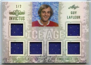
Next up are what I will call the multis. They are cards that have many swatches, but with little selection to the individual pieces. For my money, the best single-player multi-swatch cards ever done were the Complete Jersey cards, because there was a patch, a jersey, some fight strap, whatever--some variety. The ones below happen to be from the Ice Age subset, but there are other examples. Not a great design, and again, the "Ice Age" looks like my son did it, but whatever. And don't worry about the fact that the subset is literally about the start and end dates, so the ice age, of the players. But really, what is the point of having six (!) memorabilia swatches on the LaFleur if they look exactly the same?
And this Jagr. A couple of patch pieces, fine. Then four burgundy swatches from an All-Star jersey (nevermind he is in a Pens jersey again):

The Lemieux is basically the same. Four identical swatches along the bottom:

While I think the burgundy swatches at the bottom only appear to be different because of lighting, at least this one is mostly acceptable:

Again with the name--Undefeatable Fabrics is just a dumb name for a subset, but it goes back to the whole Latin Invictus meaning. We get it. This design is far too similar to the Carpe Diem one, and looks like more Gimp-skilled kids did it. This subset also has a ton of "let's put three swatches that look identical!". And poor Roy--not only is he nameless, but the pictured jersey is Habs while the swatches come from (probably) an Avs jersey. Examples:


Lastly, the one subset I actually like, the International Ice ones. Decent pics chosen to minimize airbrushing, the row of flags, the globe in the background. Sounds like a winner. See? Some good examples--Bure and Salming.


Then, uh-oh... Jagr and Golzig are from the US? Naslund is Canadian?
No.
Jagr is famously from the Czech Republic.

Olie the Goalie was born in South Africa to German parents who moved to Canada. He never applied for citizenship which allowed him to represent Germany in a number of appearances at the Olympics and World Cup. He did play a couple of seasons for the Tri-City Americans and later the Capitals, so maybe that qualifies him to have a flag from the US shown?

Mats Naslund--not Canadian. Tons of international play for his native Sweden. He was drafted by the Habs, though, so I guess he can get a Canadian flag for that?

There are other examples, but you get the point.
So I'll stand by my opinion. Invictus is garbage. It's not meant for everyone, and clearly I am not their target audience. I'm glad they have a market for some die-hard collectors. I'm just not one of them.
No comments:
Post a Comment